


How Does Color Affect Logo Design? Understanding the Psychology Behind Brand Colors
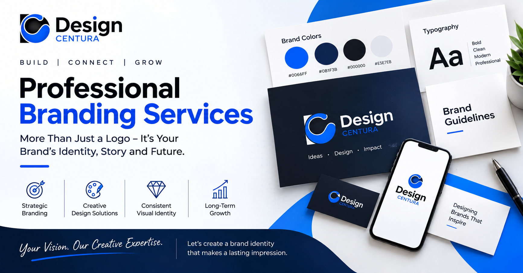
Color is one of the first things people notice in a visual identity. Before someone reads a business name or studies a symbol, the color palette can create an immediate impression. That makes the question how does color affect logo design more important than simply asking which color looks attractive. Color can influence mood, communicate positioning, support recognition, and shape how a company is perceived.
For businesses, choosing logo colors should be a strategic decision. The right palette can reinforce brand personality and visual communication, while an unsuitable combination can send a message that conflicts with the company's goals.
Why Color Matters in a Logo
A logo rarely works alone. It sits within a broader brand identity that includes typography, imagery, layouts, packaging, websites, and marketing materials. Color helps connect these elements into a recognizable visual system.
When considering how does color affect logo design, think about the feeling a customer should experience when seeing the mark. A deep blue may suggest stability and professionalism, while a vivid orange can feel energetic and approachable. Green can be associated with nature or growth, while black may communicate sophistication or authority.
These associations are not universal rules. Culture, industry, context, saturation, and color combinations can change how a shade is interpreted. Good logo branding therefore considers context rather than relying on simple color stereotypes.
How Different Colors Can Shape Perception
Blue: Trust and Clarity
Blue is frequently used in corporate, technology, finance, and professional branding. Its cooler appearance can create a sense of calm and structure.
However, using blue simply because it is popular can make a brand blend into a crowded category. A distinctive shade, supporting colors, and thoughtful typography can help create differentiation.
Red: Energy and Attention
Red can create a strong visual presence. It may communicate energy, urgency, confidence, or passion.
It can work well for brands that want an expressive and active personality. The exact shade matters: a dark red can feel very different from a bright, highly saturated red.
Green: Growth and Natural Associations
Green often connects visually with nature, health, sustainability, and growth. It can be useful for companies whose positioning relates to environmental or organic themes.
But green is not limited to those industries. Its effect depends on the overall composition and the message behind the brand.
Yellow: Optimism and Warmth
Yellow can bring brightness and friendliness to a visual identity. It may help a business appear energetic, optimistic, or approachable.
Because bright yellow can have lower contrast against white backgrounds, accessibility and practical application should be considered during logo development.
Black and White: Simplicity and Versatility
Black can create a sophisticated, confident, or minimalist impression, while white provides space and contrast. A black-and-white logo can also be extremely versatile.
Every logo should be tested without color. If the concept remains recognizable in monochrome, it has a stronger structural foundation.
Color Should Match the Brand Personality
A common mistake is choosing colors first and trying to build the brand around them later. A more effective approach begins with the desired personality.
Ask:
- What should customers feel?
- What does the business want to be known for?
- Is the brand traditional or contemporary?
- Should it feel premium, friendly, bold, or understated?
- What visual qualities distinguish it from competitors?
These questions connect color selection to brand strategy.
For example, a premium consulting company may prefer a restrained palette with carefully controlled contrast, while a children's education brand may benefit from a more playful combination. Both can be effective because the choices support different positioning.
This is another reason how does color affect logo design cannot be answered with a simple list of "best" colors. The best choice is the one that supports the brand's intended meaning.
Think About Color Combinations, Not Just Individual Shades
A single color rarely tells the whole story. Combinations create hierarchy, contrast, and visual rhythm.
A primary color can establish recognition, while secondary colors support backgrounds, accents, and marketing materials. Designers should consider how the palette behaves across light and dark backgrounds and whether enough contrast exists for clear communication.
Businesses should also think about consistency. Once colors are selected, brand guidelines can define their use across websites, social media, stationery, advertisements, and packaging.
For companies exploring custom logo design services, requesting a complete color system rather than one isolated color value can make future branding easier to manage.
Consider Your Industry Without Copying Competitors
Industry research is useful, but copying category conventions can weaken differentiation.
Look at competitors and identify common patterns. If nearly every competitor uses the same dark-blue palette, another visual direction may provide an opportunity to stand apart—provided it remains appropriate for the audience.
This is where strategic graphic design becomes valuable. The objective is to understand expectations while finding a distinctive position within them.
A strong logo should feel like it belongs to its business, not like a slightly modified version of another company's identity.
Test the Palette in Real Situations
A color that looks excellent on a designer's screen may behave differently in practical applications.
Test the logo on:
- Website headers
- Mobile screens
- Social media profiles
- Printed documents
- Packaging
- Signage
- Merchandise
- Dark and light backgrounds
Also test different sizes. A detailed color treatment may lose clarity when a logo becomes very small.
Accessibility should be part of the review as well. Adequate contrast can improve readability and usability, especially when logo elements are used alongside text.
A Practical Decision Framework
If you are still asking how does color affect logo design, use a simple evaluation process.
First, define the emotional and strategic qualities the business wants to communicate. Second, research the visual language of the industry. Third, develop several palette directions rather than committing immediately to one. Fourth, test those palettes in real applications. Finally, select the option that balances personality, distinction, readability, and long-term flexibility.
This approach prevents personal preference from becoming the only deciding factor.
The Design Centura Perspective
Design Centura treats color as one part of a broader visual identity rather than an isolated decoration. A logo's palette should work alongside typography, composition, symbols, and other brand assets.
When businesses consider custom logo design services, they can benefit from discussing not only the appearance of a color but also where and how it will be used. A practical palette can support brand consistency across multiple communication channels.
The goal is not to choose the most fashionable color. It is to create a visual language that makes sense for the business and remains useful as the identity develops.
Conclusion
Understanding how does color affect logo design requires looking beyond basic color psychology. Color can influence perception, support brand recognition, create differentiation, and help establish a consistent visual identity. Yet its effectiveness depends on context, combination, application, and the personality of the business.
The strongest approach is to connect color decisions with brand strategy, audience expectations, competitor research, typography, and practical usage. Test the palette in real environments and make sure the logo remains clear in both color and monochrome.
Design Centura recognizes that effective branding comes from thoughtful decisions working together. When color supports the right message instead of simply following a trend, it can become a valuable part of a memorable and scalable identity.
Ultimately, how does color affect logo design is a question about communication. The right palette does more than make a logo attractive—it helps the visual identity express what the business wants customers to understand and remember.

 English
 Arabic
 French
 Spanish
 Portuguese
 Deutsch
 Turkish
 Dutch
Dutch
 Italiano
 Romaian
 Portuguese (Brazil)
 Greek
Greek